Archive for the ‘graphics’ Category

Subpixel image resampling results

Tuesday, October 4th, 2011

I implemented my cleartype for images idea and here are the results.


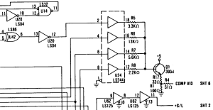
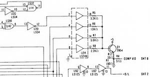
(This image, by the way, is part of the schematic of the original IBM CGA card - specifically, the composite DAC stage which I've mentioned before.)

The first image was resampled by Paint Shop Pro 4.12 (I know it's ancient, but I never got on with any of the newer versions). This resampling algorithm works directly on the sRGB values (it's not gamma corrected) so whenever there's a grey pixel in the output image, it's too dark.

The second image was resampled using proper sRGB<->linear conversion and an ideal sinc filter (which means it's very slow - several seconds per image). If you zoom into this, you'll notice some "ripples" around the horizontal and vertical lines which are due to the band-limited resampling - getting rid of them would require higher spatial frequenices than this image can accurately reproduce, so really the image is about as correct as it can be. Because the ripples are clipped on the high side, this does make the image slightly darker on average than it should be, but the difference isn't noticable to the human eye).

The third image was resampled by the "cleartype for images" algorithm (again with a sinc filter in linear space) using a band-limit of the subpixel resolution. As you can see, it's noticably sharper but does have annoying "fringes" of colour as thin lines move from one subpixel to another.

The fourth image is the same as the third except that the band-limit is that of the pixel resolution rather than that of the subpixel resolution (but the filters are still centered on the subpixels for the corresponding channels). This completely eliminates the fringing (yay!). As expected, it's not actually sharper than the non-cleartype image but some of the near vertical lines are smoother and the text is much more legible than any of the other versions.

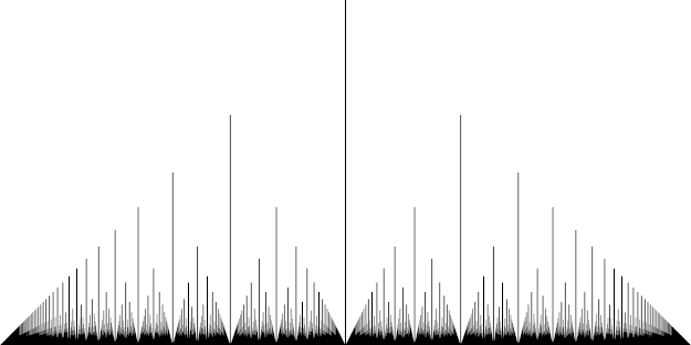
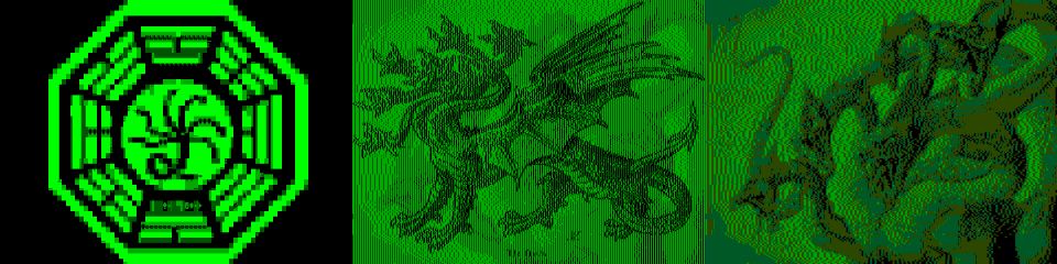
Here's the same four methods with a colour image:


First let's look at the one with incorrect gamma - notice that a lot of the sharpness in the detailed regions is gone.

The second image is much better - the details remain sharp.

The third image is a mess - details exhibit aliasing problems because when the image has detail in just one channel, the band-limit frequency is three times the pixel frequency.

The fourth image is pretty similar to the second but there are a few places where sharp, near-vertical lines are a bit smoother, for example the brightly lit part on the left of the hat.

So, I think this experiment is a success. The downside is that I now need to go back through all my previous blog posts and resample the images again to improve them.

Euclid's orchard improved image

Friday, September 2nd, 2011

I wasn't very impressed with the Euclid's Orchard perspective picture on Wikipedia (grey background, limited number of "trees", no anti-aliasing) so I made my own:

Oscilloscope waveform rendering

Saturday, August 13th, 2011

One thing that always annoyed me about Cool Edit Pro (now Adobe Audition which seems to be much more annoying to use in several respects) is the quality of the waveform visualization. What it seems to do is find the highest and lowest signals at each horizontal pixel and draw a vertical line between them (interpolating as necessary if you're zoomed way in). That means that when you're zoomed, the waveform is a big blob of green with very little useful detail in it. Only green and black pixels are used - no intermediate colours are used to smooth the image. Other waveform editors I've tried seem to work in similar ways.

I think we should be able to do much better. Suppose we rendered the waveform at at an extremely high resolution (one pixel per sample horizontally or better) and then downsampled it to our window size. There's a problem with doing it that way, though - unless the waveform only covers a few pixels vertically, the waveform is going to be spread out amongst too many pixels and will be very dark. Imagine an analog oscilloscope with the beam intensity set at normal for a horizontal trace and then visualizing a signal which oscillates over the entire display at high frequency - most of the signal will be invisible with the exception of the peaks.

The solution to this with the analog oscilloscope is to increase the beam intensity. We can do exactly the same thing with a digital visualizer too - we're not limited to 100% intensity for our intermediate calculations (if a pixel ends up at more than 100% in the final image, we can clamp it or use an exposure function). Increasing the intensity to infinity gives us the Cool Edit Pro visualization again - the any pixel the waveform passes through is fully lit.

What does it look like? Watch this space to find out!

Edit 14th July 2013:

Oona Räisänen beat me to it.

Cleartype for images

Friday, August 12th, 2011

It occurs to me that one could use similar sub-pixel techniques used by ClearType to improve the resolution of graphics as well as text. One way to do this would be to downsample an image using a kernel with different horizontal phases for red, green and blue. However, this wouldn't take into account the fact that when making one pixel red, you need to make a nearby one cyan to avoid annoying fringes. With text, the geometry can be controlled so that the widths of horizontal spans are always a multiple of 3 subpixels, but if you're starting with a bitmap you can't really adjust the geometry. Perhaps it wouldn't matter in practice: the same effect happens with NTSC television signals - if you get a black and white pattern with horizontal frequency components in the chroma band you'll get colour fringes for exactly the same reason, but you usually don't notice it because for most images it evens out on average.

I'll have to do some experiments and see what happens.

CGA Hydra

Tuesday, August 11th, 2009

A while ago, Trixter challenged me to figure out if it was possible for a CGA card with both composite and RGB monitors attached to it to display a different image on each display. At first I thought this was impossible because the composite output is just a transformation of the RGB output - the RGB output contains all the information that the composite output contains.

But that reasoning only works if you're close up. If you stand back sufficiently far from the screens, adjacent pixels will blur into each other so this is no longer necessarily true. Suppose we have a pattern that repeats every 4 high-resolution pixels (or half an 80-column character, or 1/160th of the screen width, or one colour carrier cycle) and we stand sufficiently far back that this looks like a solid colour. On the RGB monitor this will just be an average of the 4 colours making up the pattern. So, for example, black-black-white-black and white-black-black-black will look the same on the RGB monitor, but they will look different on the composite monitor because these two patterns have different phases with respect to the color carrier, so they will have different hues.

That explains how we can get details on the composite monitor but not on the RGB monitor, but what about the other way around? This is a bit more complicated, because it requires knowing some more details about how the CGA generates (non-artifact) colour on the composite output. For each of the 8 basic colours (black, blue, green, cyan, red, magenta, yellow and white) there is a different waveform generated on the card. The waveform for the current beam colour is sent to the composite output. The waveforms for black and white are just constant high and low pulses, but the waveforms for the 6 saturated colours are all square waves of the colour carrier frequency at different phases. The green and magenta lines switch between high and low on pixel boundaries, the other 4 at half-pixel boundaries (determined by the colour adjust trimpot on the motherboard).

What this means is that if you're displaying a green and black or magenta and black image, the pixels are essentially ANDed with this square wave. The pixels corresponding to the low parts of these waves have no effect on the composite output. So you can use these pixels to make the image on the RGB monitor lighter or darker whilst having no effect on the composite image.

Here's what the finished result is supposed to look like (with another image on an MDA display as well):

Note that I've allowed the composite image to show through on the RGB monitor a little in order to improve contrast.

Stupid image resizing

Wednesday, October 1st, 2008

It greatly annoys me when web pages don't resize images properly. In particular, one thing that there seems to be an epidemic of at the moment is web pages that embed images at one resolution and then use styles like "max-width: 100%" in a column narrower than the image. This makes the images look horrible because most browsers (at least IE7 and Firefox 2) resize the images by just dropping columns, causing diagonal lines and curves to be all wavy. At least Firefox 3 gets this right and resamples the image but it's still a waste of bandwidth.

Along similar lines, here is an interesting article about the interactions between gamma correction and image scaling. I hadn't thought about that before (my own image resizing routines always just assumed a linear brightness scale) but this has definitely opened my eyes.

Ray tracing in GR

Saturday, September 27th, 2008

Following on from this post, a natural generalization is that to non-Euclidean spaces. This is important for simulating gravity, for example rendering a scientifically accurate trip through a wormhole (something I have long wanted to do but never got to work). The main difference is that ones rays are curved in general, which makes the equations much more difficult (really they need to be numerically integrated, making it orders of magnitude slower than normal ray-tracing). One complication of this is that generally the rays will also curve between the eye point and the screen. But the rays between your screen and your eye in real life do not curve, so it would look wrong!

I think the way out of this is to make the virtual screen very small and close to the eye. This doesn't affect the rendering in flat space (since only the directions of the rays matter) and effectively eliminates the need to take into account curvature between the screen and the eye (essentially it makes the observer into a locally Euclidean reference frame).

Another complications of simulated relativity is the inability to simulate time dilation. Well, you can simulate it perfectly well if you're the only observer in the simulated universe but this would be a big problem for anyone who wanted to make a relativistically-accurate multiplayer game - as soon as the players are moving fast enough with respect to each other to have different reference frames, they will disagree about their expected relative time dilations.

Linux cleartype subtly broken

Wednesday, September 17th, 2008

Most modern graphical desktops have an option to render fonts taking into account the positions of the sub-pixels on liquid crystal displays. Since these are always in the same positions relative to the pixels, one can subtly alter the horizontal position of something by changing its hue. This effectively triples the horizontal resolution, which can make for a great improvement in the readability of text.

Unfortunately, my Ubuntu desktop doesn't do this correctly - some bits of text have a yellowish fringe and some bits of text have a bluish fringe, both of which are quite distracting. The problem is that while you can alter the horizontal position of something at sub-pixel intervals, you can only alter its width by whole pixels (otherwise the hue changes don't cancel out and integrating over a region of the screen gives a yellow or cyan colour.

I've therefore had to switch my desktop to use grayscale anti-aliasing, which is a bit more blurry. Fortunately the pixels on my monitor are small enough that this doesn't bother me very much. I do prefer the font rendering that Windows does, though. While FreeType does apparently include code to support Microsoft's patented programmed hinting I can't seem to get the font rendering on Linux to look as good as it does on Windows.

Equations for 3D graphics

Tuesday, September 16th, 2008

When I first learnt how to do 3D graphics it was as a recipe. You take your 3D world coordinates x, y and z and rotate them (rotation matrices around the coordinate axes are particularly easy to write down). If you want perspective, you then divide x and y by z (for isometric views just ignore z). Next you scale the result by the number of pixels per world-coordinate unit at z=1 and translate so that x=y=0 is in the center of the screen.

This worked great, but didn't tell me why this was the right thing to do.

Later, reading about ray tracing I realized what was really going on. Your model is in 3D space but also in 3D space are some additional points - the entrance pupil of your eye and the pixels that make up your screen. If you imagine a straight line from your eye passing through a particular point of your model and going on to infinity, that line may also pass through the screen. If it does, the point on the screen that it passes through corresponds to the pixel on the physical screen at which that point should be drawn.

Since computer screens are generally rectangular, if the positions of the corners of the screen are a, b, c and d (a and d being diagonally opposite to each other) the position of the fourth corner can be determined from the first three by using the equation a+b=c+d. So to fix the position, orientation and size of the screen we only need to consider 3 corners (a, b and c). We also need to consider the position of the eye, e, which is independent of a, b and c. We thus have 12 degrees of freedom (3 coordinates each for a, b, c and e). Three of these degrees of freedom correspond to translations of the whole screen/eye system in 3D space. Two of them correspond to orientation (looking up/down and left/right). Two correspond to the horizontal and vertical size of the screen. Three more give the position of the eye relative to the screen. One more gives the "twist" of the screen (rotation along the axis between the eye and the closest point on the screen plane). That's eleven degrees of freedom - what's the other one? It took me a while to find it but eventually I realized that I was under-contraining a, b and c - the remaining degree of freedom is the angle between the top and left edges of the screen (which for every monitor I've ever seen will be 90 degrees - nice to know that this system can support different values for this though).

If you solve the equations, this system turns out to be exactly the same transformations as the original recipe, only a little more general and somewhat better justified. It also unifies the perspective and isometric views - isometric is what you get if the distance between the eye and the screen is infinity. Obviously if you were really infinitely far away from your computer screen you wouldn't be able to see anything on it, which is why the isometric view doesn't look as realistic as the perspective view.

Many 3D graphics engines allow you to set a parameter called "perspective" or "field of view" which effectively increases or decreases how "distorted" the perspective looks and how much peripheral vision you have. This is essentially the same as the eye-screen distance in my model. To get the most realistic image the FoV should be set according to the distance between your eyes and your screen.

Generations of screen sizes

Sunday, July 6th, 2008

If you make a list of common screen resolutions and plot them on a log/log scale, you will notice that a regular pattern emerges - given an x by y resolution, x*2 by y*2 also tends to be common. However the sizes are not evenly distributed throughout logarithmic spaces - there are gaps which suggest different "generations" of monitor sizes, each monitor having 4 times the number of pixels as the corresponding monitor in the previous generation. I suspect this is because of the influence of TV - the resolutions are clustered around powers of 2 of TV resolutions.

Generation 1 - 256-480 pixels wide, 180-300 pixels tall (non-interlaced TV, handhelds)
Generation 2 - 512-960 pixels wide, 360-600 pixels tall (interlaced TV, older computer monitors)
Generation 3 - 1024-1920 pixels wide, 720-1200 pixels tall (most current computer monitors)
Generation 4 - 2048-3840 pixels wide, 1440-2400 pixels tall ("Q" standards - very high end monitors)
Generation 5 - 4096-7680 pixels wide, 2880-4800 pixels tall ("H" standards - no monitors exist yet)