Okay, I tried the second oscillator and the effect of the color adjust capacitor is definitely frequency. Based on the beat patterns it looks like the range of the capacitor is maybe 300ppm or so and (with very careful adjustment) it's possible to get the beat frequency down to a few ppm. SMPTE 170M specifies a tolerance of about 3ppm, but frequency differences of less than 30ppm or so are unlikely to be noticeable even with a TV which doesn't use the received color burst frequency.
Archive for the ‘colour’ Category
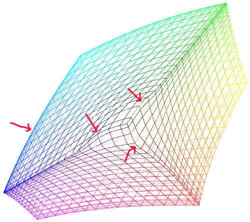
Beats of two colour carriers
Saturday, October 15th, 2011Effect of the color adjust variable capacitor
Friday, October 14th, 2011For a long time, I thought the effect of the "color adjust" variable capacitor on the XT motherboard was to change the duty cycle of the 14MHz clock signal going into the CGA card. This would in turn change the hue of the green and magenta chroma colours (and all the artifact colours) while leaving the yellow, blue, red and cyan artifact colours alone.
However, having now tried it out, this does not seem to be the case at all:
The hues of all the chroma colours are changed. I don't really understand why, since the yellow and color burst signals are the same, so there's no way to introduce a phase shift between them (and hence no way to change the hue of that colour).
Looking at information about crystal oscillator circuits, a variable capacitor like that is usually included in order to fine-tune the frequency of the circuit. Quartz crystal frequency sources have a very small damping factor (high Q value) which means there's a very narrow range of frequencies in which they like to oscillate, but the external circuitry can influence the output frequency a little bit (as we've seen before).
But what we're seeing on the screen there doesn't look like the effect of changing the frequency either. With a frequency that isn't quite right, I'd expect to see hue changes on the right-hand side of the screen but not the left.
That makes me think that the TV must be using both the phase and frequency of the detected color burst for its reference. I'm not sure why it would do that - it seems like it would be more trouble than it's worth. Maybe it was too difficult to make an oscillator that retained the right frequency with sufficient accuracy that the right hand side of the screen never exhibited a hue drift with respect to the left over the entire lifetime of the TV and in all the conditions in which it might operate.
And that still doesn't explain why the hue of the yellow bar changes (the effect is the same even if I put it at on the left-hand side of the screen). Perhaps it's to do with the TV expecting 227.5 color carrier cycles per scanline and receiving 228.
I guess I can find out for sure whether the effect of the capacitor is frequency or not by using a second 3.57MHz oscillator connected to the TV and observing how the beat pattern changes as the capacitor is turned.
Perceptual colour space update
Monday, August 15th, 2011Last year, I wrote about some code I had written to find maximally distributed sets of colours in perceptual colour space. I was having some problems with the code at the time, but since then I have got it working. I fixed it by only repelling each particle from the nearest one to it - then particles quickly settle into the points where they are equidistant from the nearest particles on each side.
Here are the colours it came up with in LUV space:
And here are the colours it came up with in LAB space:
I also did a variation where it just chooses a different hue for each colour, maximizing the saturation (so arranging colours in a ring, rather than throughout a volume) - this is the LAB version but the LUV version is very similar:
I want to do a little flash applet so you can see how the colour particles repel and rotate them around in 3D space - it's a very good way to visualize the perceptual colour solids.
Most different colours
Wednesday, July 7th, 2010For various visualization programming tasks, it's useful to have a set of colours that are as far apart as possible. I set out to write a program to generate such sets.
The first problem is that we must work in a perceptual colour space such as Lab rather than the usual sRGB, or our colours will be overly concentrated in the areas where sRGB over-represents.
Next, I set up a system of mutually repelling particles and let them arrange themselves (sliding along the sides and edges as required). This didn't work too well even just in sRGB space - the trouble is that I don't care about minimizing the distance to the most distant colours, only the nearest ones. I thought about do a Delaunay triangulation to find the nearest neighbours of each point, but it turns out that's overkill - all you need to do is just repel the 6 nearest particles (and recalculate what those particles are after each frame). If you end up with the closest points all on one side, the particle will be repelled away until one of the closest points is on the other side.
Even with this fix, I was still getting strange results. After some head-scratching, I realized that it was just to the "kinks" in the some of the edges of the sRGB gamut in Lab space:
The particles tend get "stuck" in these kinks.
I'm not quite sure what to do about this. Perhaps I can find optimal sets in a rectilinear gamut and then gradually morph this into sRGB while continuing to let the particles repel.
Fall foliage
Friday, October 30th, 2009Inspired by this XKCD comic:

I made this:

And this, going in the opposite direction:

Widdershins of hue
Sunday, June 22nd, 2008Here is a concept that I feel that there ought to be words for but which there don't seem to be.
Suppose we arrange the spectrum of colours into the familiar colour wheel:

What is the word that corresponds to "clockwise" on this diagram (and "anticlockwise" on the mirror image of this diagram)? I.e. the word that means "more blue than red", "more green than blue" and "more red than green" simultaneously? What is the word for the opposite hue angle direction?
Bonus points for the best neologisms for these equal and opposite concepts.
The undiscovered colour
Sunday, February 5th, 2006I'm reading a great book at the moment, Dave Gorman's Googlewhack adventure. This book chronicles the epic procrastination techniques Dave Gorman used to avoid starting to write a novel. The novel he was going to write was about a guy who sees a brand new colour in a dream and travels the world searching for an example of it.
Sounds pretty far fetched, no? Well, quite by accident I came across this page in which a physicist Andrew Hamilton comes up with an entirely new colour.
In case you're put off by the maths on that page, here's a basic explanation. The human eye contains 3 types of colour receptors (call them red, green and blue for the sake of argument). When we see a particular colour, these receptors are triggered in some ratio - the ratio determines the hue of the colour you are looking at. The red receptors detect long wavelengths, the blue receptors detect short wavelengths and the green receptors detect wavelengths in between. However, even when looking at even the purest green light the red and/or blue receptors are triggered to some extent because their ranges of sensitivity all overlap.
So what would you see if you could trigger just the green receptors? It would be a colour that no-one had ever seen before, since light with this colour isn't physically possible. Hamilton hypothesizes that this colour (which he calls "psychedelic aquamarine") would be the colour you got if you took the colour of the water around the reefs of Heron Island in the Great Barrier Reef of Australia and subtracted white to make the colour even more saturated:
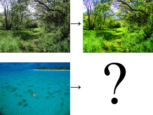
In this picture, psychedelic aquamarine would be to the bottom left image as the top right image is to the top left image. When I tried to apply the same transformation the bottom left image that I applied to the top left image to get the top right image, nothing happened (which is hardly surprising since obviously my computer is not capable of displaying psychedelic aquamarine).
According to Hamilton, people who are red/green colour-blind see psychadelic aquamarine all the time, whenever they look at something which us non-colour-blind people would see as red. Such a colour would stimulate the green receptors, but not the blue receptors (as it's too red) nor the red receptors (since these don't exist in such people). However, since we can only describe colours by mentioning things which are that colour, a colour-blind person's description of psychendelic aquamarine would probably sound very much like a colour-seeing person's description of the colour red.
I wonder if it would be possible to make a machine that would allow people to see this colour. It would have to work by scanning someone's retinas, identifying where the green receptors are and firing out photons in such directions that they only hit the green receptors. If someone built such a machine and stared into it, would they just see a very vivid (bluish) green or would they have the incredible experience of seeing a brand new colour that they would never have seen before?
[Update 8/8/2011] It turns out that it is possible to see psychedelic aquamarine with no special equipment, due to the fact that colour receptors get fatigued if they look at the same colour for a long time. The Eclipse of Mars illusion (about halfway down the page) exploits this fact to enable you to see psychedelic aquamarine. Try it - it's extremely impressive!