Many colleagues, on seeing my screen for the first time, have been horrified at how small the text on my screen is. I tend to use 1600x1200 monitors, and a 6x8 pixel font for coding purposes. I have good vision at normal head/screen distances and I like to be able to see a lot of text at once (I can see the "big picture" and also the details without having to explicitly zoom).
My preferred font is the 6 point Terminal font that comes with Windows. When I started my new job, I switched to a Linux machine for most of my day-to-day work and one thing that took me a long time to figure out was how to get my terminal windows to display this font. I got it working in XTerm but copy and paste works better in Gnome terminal, which refused to acknowledge any non-TrueType fonts or even bitmap fonts in a TrueType package.
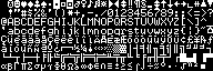
I eventually went through the same route that this guy went through to create his fonts - I extracted the bitmaps from the .fon file and turned them into outlines by creating a square for each dark pixel. The resulting .ttf file is 30 times as big as the original bitmap but it seems to work fine with everything I've thrown at it.
Here is the resulting TrueType font and here is what it looks like:
This is terrific! I've been struggling for years with minor incompatibilities between the .fon version of Terminal (vgaoem.fon) and putty / curses on linux. Tmux, Screen, ncdu, everything had rendering problems. Alternative fonts simply weren't as good, with modern programmers considering a 9 point font (or 7x10 fixed) to be "Tiny". The closest modern replacement I could find (proggy tiny) was 6x9 and not as clear, to me. If I set your font size to 12pt in putty and turn off anti-aliazing, your font renders identically to the old 6x8 Terminal font AND solves all the legacy issues with text linedraw applications under linux / putty. Thank you so much!