The original IBM Color Graphics Adapter has a curious quirk - it won't by default display colour on the composite output in 80-column text mode. By looking at the schematics, I've figured out why this is, and what the CGA's designers could have done differently to avoid this bug. The following diagram illustrates the structure of the various horizontal and vertical sync pulses, overscan and visible areas in the CGA.
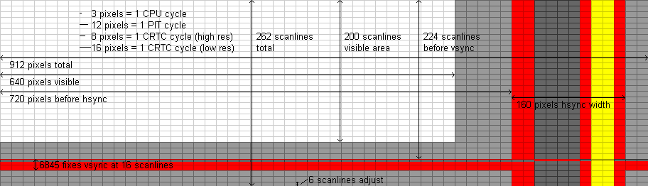
There are two horizontal sync pulses - there's the one generated by the 6845 (the 160-pixel wide red/grey/yellow band in the diagram) and there's the one output to the monitor (the 64-pixel wide grey band within it). The CGA takes the 6845's hsync pulse and puts it through various flip flops to generate the output hsync pulse (delayed by 2 LCLKs and with a width of 4 LCLKs) and also the color burst pulse (in yellow, delayed by 7 LCLKs and with a width of 2 LCLKs).
The 6845 can generate an hsync pulse anywhere from 1 to 16 clock ticks in width. The IBM's BIOS sets it up at 10 ticks (as shown in the diagram). However, in 80-column text mode those ticks are only half as wide, so only extend 3/4 of the way through the output hsync pulse. The 6845's hsync pulse ends before the color burst pulse gets a chance to start, so it never happens and the display will show a monochrome image.
By changing the overscan color to brown, one can create one's own color burst signal at the right point in the signal, and this was the usual way of working around the problem (possibly the only way that works reliably)
By changing the 6845's pulse width to the maximum of 16, one could generate the first half of the color burst pulse (I think) and some monitors might recognize this as a color burst.
If the CGA's designers had started the output hsync pulse at the beginning of the 6845's hsync pulse (or delayed by only 1 LCLK instead of 2) then using the maximum pulse width would have been sufficient to generate the correct color burst. I guess they were just trying to center the output hsync pulse and the color burst within the 6845 pulse, without thinking of the high-res case.
The diagram also shows why interlaced mode doesn't work on the CGA - the output vertical sync pulse is generated in a similar way to the output horizontal sync pulse, only it's 3 lines instead of 4 LCLKs. It always starts at the beginning of an output hsync pulse, so a field can't start halfway through a scanline.
Why brown, though?
Good question. It's got to be a colour with hue in order to get a 3.57MHz signal, so that rules out black, white and the two greys. NTSC specifies that the phase corresponds to the yellow hue, so the two best candidates are yellow and brown. In the composite output these differ by signal level (there is an additional DC component in the high-intensity colours) and brown is closer to the "correct" signal than yellow (the actual signal emitted by the CGA for the color burst is darker still, and I think the NTSC specifies a color burst with a lower saturation than the CGA provides). Yellow might work (and, if it does, will produce the same colours as brown), but some monitors might get confused by a signal so far out of spec.
The other low-intensity saturated colours (blue, green, cyan, red and magenta) would work just as well as brown, but the hues would be different than normal. That gives a very cheap way to do hue shifting, though.
It's also quite likely that it was given as a cheap way to allow a choice between monochrome (well, greyscale) and colour output. As 80-column graphics mode is only 1-bit, and the background colour is stuck as black, changing the foreground colour is a purely cosmetic thing that doesn't really have a great deal of use most of the time, unless you can palette-swap partway down the frame in order to have differentiated title and body text, or two different coloured graphics areas.
At least, in the graphics mode. Text mode, of course, you have more colour choice. But, it still defaults to greyscale...
Why would you want to do this? Because of the quite serious colour fringe artefacting that would result on most monitors. It was a significant enough effect that a lot of games and graphic program writers ended up using it as a way to extend the otherwise disappointing colour palette of the system - thanks to the colourburst-synched dot clock, a particular 4-pixel pattern would be interpreted by an attached NTSC monitor as one of 16 different steady colours instead, and so a reasonable facsimile of e.g. the C64's graphical abilities was obtained.
All well and good, if that's what you're going for. If what you were actually after was clear 80-column text or 640x200 and you didn't care so much for the colours, it was a major problem that could make some letters or diagrams nearly unreadable. But of course you still want the colour in low-rez mode, and it'd be nice to have the artefact colours if you loaded a game after hours. (We can reasonably expect that anyone serious enough to want to use 80-column 16-colour pure text mode for extended periods would stump up the extra couple hundred bucks for a TTL RGB monitor instead, which is unaffected by the presence or absence of colourburst and just wants the plain sync signals)
Thus you allow the software designers a choice. If their program is meant to run at 640x200 B/W, then they use the default mode, with black background and white foreground, which will look the same on a monochrome monitor, RGB TTL and a composite colour, as in the latter case the colour decoding circuitry is switched out. If it's 80x25 text but will still work/look better in greyscale vs fuzzy colour, then they do the same, and it'll look similar on both monochrome and composite, but get a colour upgrade on TTL. If it's supposed to run artefact colours (as an upgrade vs 320x200 4-colour or faked 160x100 16-colour semi-textmode), or colour text is absolutely crucial to its operation even if it's a bit corrupted, then they manually activate the colourburst by setting a border colour, and it bursts into life on a composite screen.
And as IBM were one of the main suppliers of screens at the time, and they would of course make somewhat more profit from sales of TTL RGB screens vs plain old composite ones, they might have thought it clever to promote initial purchasing, or better yet upgrading to the more expensive option by having any lazily programmed software run in greyscale on composite even though it appears in full colour on a TTL...
Graphics modes, and 40-column text mode, don't require setting the border colour to get colour on the composite output, since the hsync pulse isn't truncated in those modes.
There is a (documented and officially recommended) way to disable the color carrier to improve picture quality on monochrome composite: set +BW, bit 2 in the mode register. This works in all modes (including 80-column text mode with a wider sync pulse and/or a border colour set), and has no effect on a TTL monitor. So I still maintain that truncating the hsync pulse in 80-column mode was not a deliberate design choice.
Here's another piece of evidence that it wasn't deliberate: the truncation doesn't just cut off the color burst neatly but also cuts off part of the actual sync pulse, taking it slightly out of spec. This didn't bother any monitors as far as I know, but it's at odds with how careful the IBM engineers were to (in all other respects) make the signal as close to NTSC standard as possible given the limitations.
I do agree that IBM did not expect people to use colour 80-column text mode with a composite monitor, or they would have noticed this problem sooner (and likely fixed it).